I met the owner of this lovely jewelry business during a local art fair in 2019. We chatted about lots of things, especially what life was like as small business owners and the unique challenges it brings. Our paths crossed a few more times, and it seemed like life would continue on that way, with our respective businesses growing little by little as time went on.
Then 2020 happened.
And art fairs stopped. Stores closed. Everything closed. Everything seemed to have stopped.
Our paths didn't cross anymore, except for the occasional like on Instagram. I put my business on hold as I adjusted to my kids being at home instead of at school, and to the ever-present threat of a deadly pandemic as a high-risk individual. I worried about small businesses, which report after report told me would be dying off in droves, and I thought good thoughts for my small biz-owner friends in general, but in the middle of, well, everything, I couldn't think about specific businesses and whether they'd make it to the other side of this. It was just too sad, since I couldn't do anything about it. Not just then.
A few months in, after the initial shock had worn off and I had figured out my new normal(-ish), I was able to take on work again. I had always focused my design business toward small businesses and nonprofit orgs, but now it was more important than ever. I wanted to help.
And that's when Jamie reached out to me.
She had been struggling during this time, like we all had been.
Her jewelry business, which she had sustained throughout the spring and summer through the few vendor fairs that remained open, but it was clear to her that something would have to change in order to survive. She had a plan, a new business name, and just needed the visual identity to complete the pivot from in-person sales of highly detailed jewelry to more streamlined, simple wholesale offerings. It was just more sustainable for a one-person operation. She was almost there, all she needed was a brand identity:
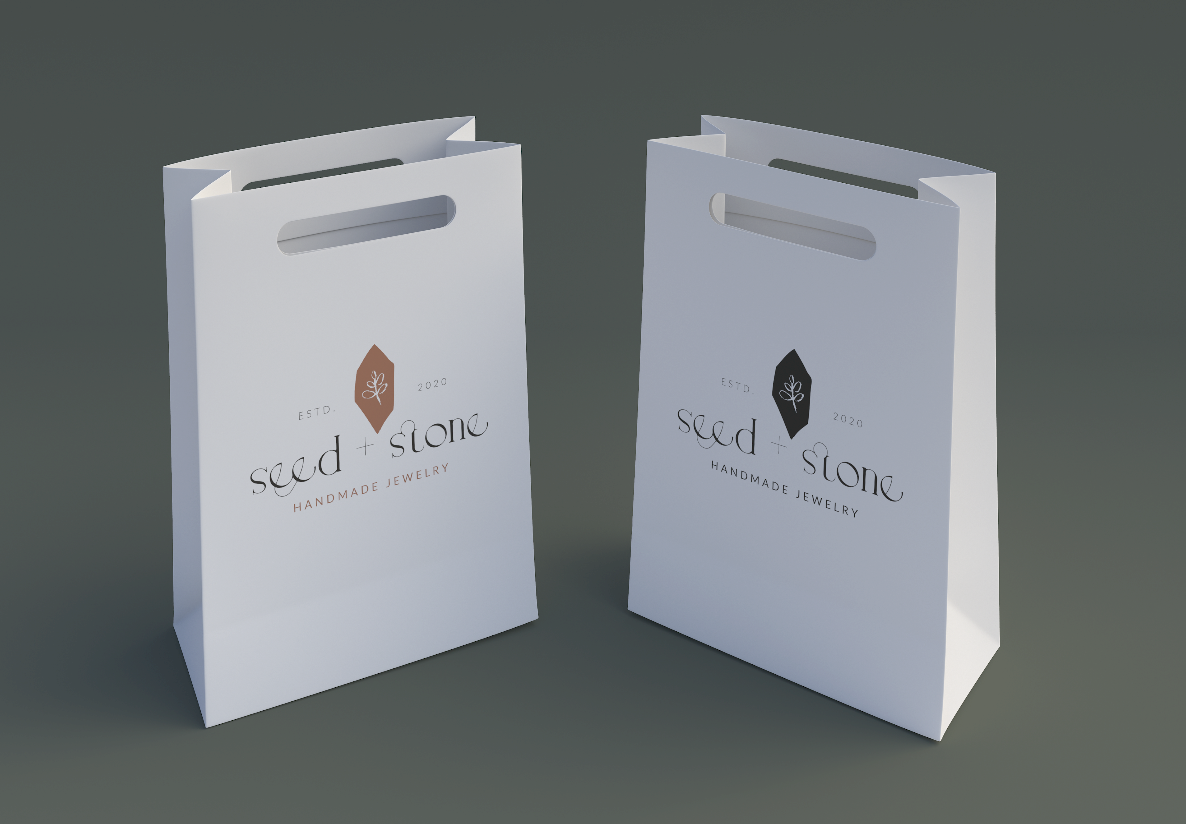
Shopping Bag Mockup
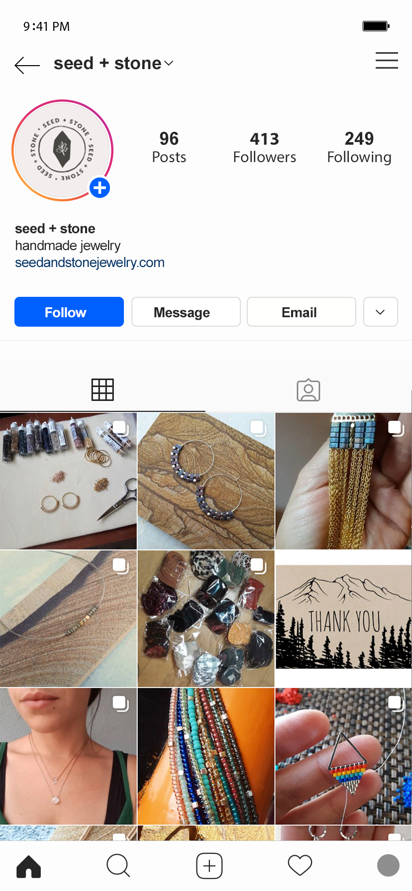
Social Media Mockup
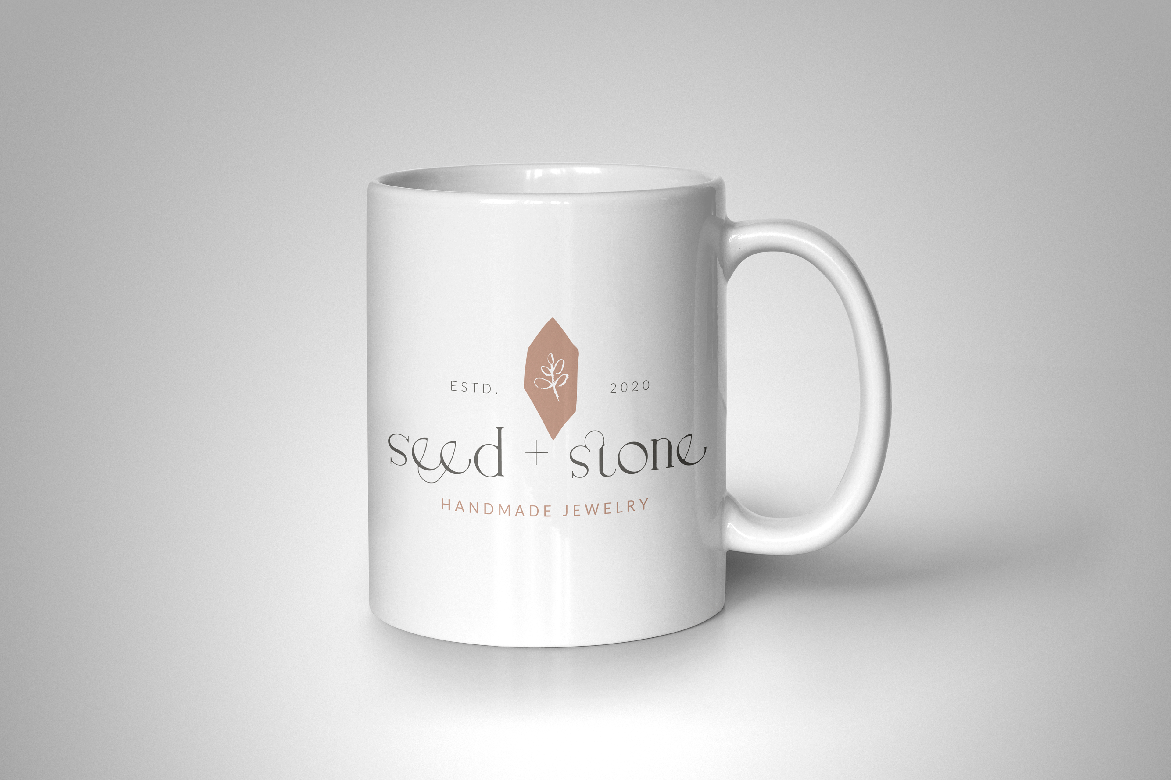
Merch Mockup
Large Packaging Mockup
Store Signage Mockup
Event Signage Mockup
Sticker Mockup
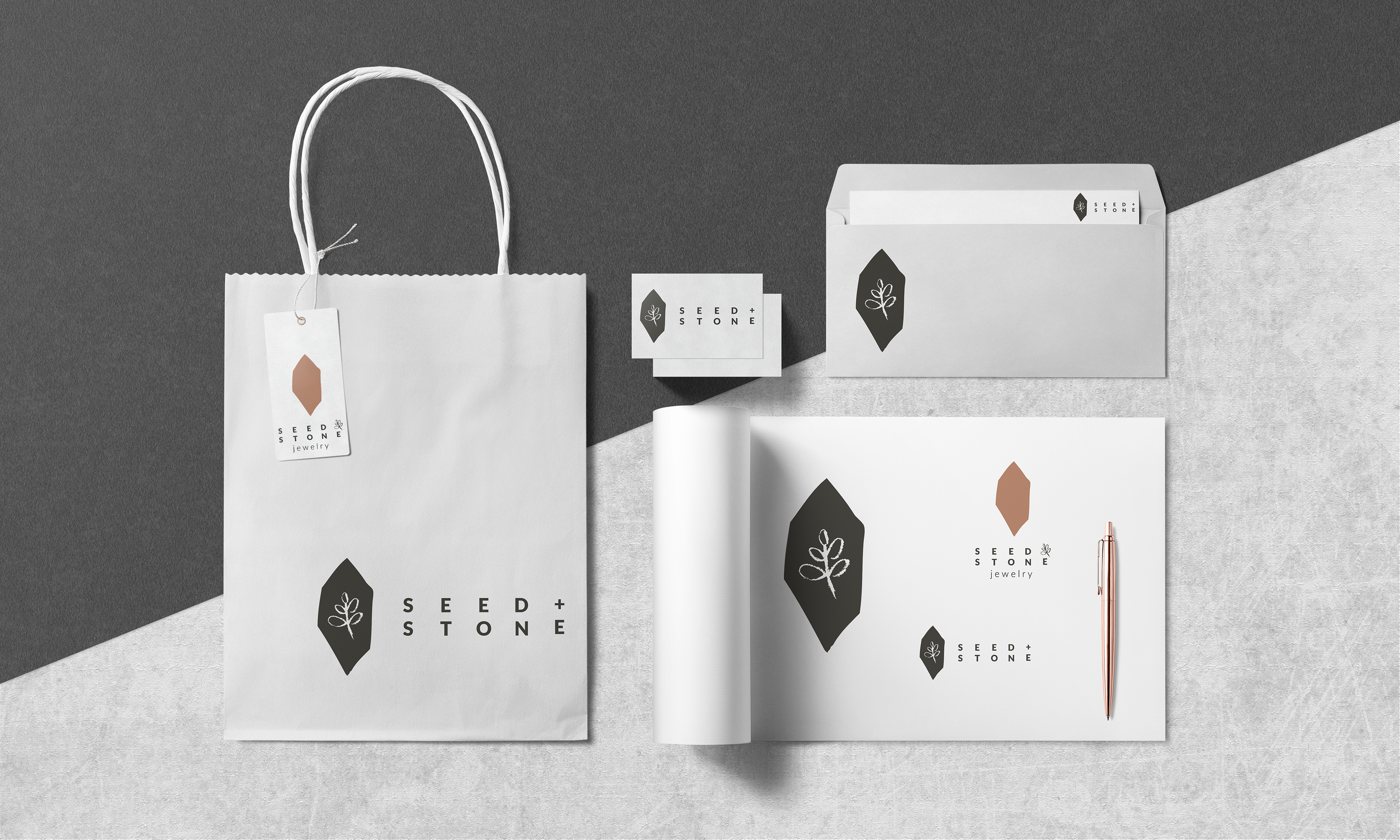
Alt Logo Mockups
Our challenge was to create a brand that would invite new customers without pushing away her existing enthusiastic audience. A challenge due to the dramatic shift in her jewelry design from meticulous, intricate designs to simpler streamlined designs. We ended up on the following guidelines:
- clean & simple with limited colors
- thin, dainty, clean lines
- non-competing visuals
- appeal to as broad an audience as possible.
And we also considered:
- visualize new business name (seed + stone) to further reinforce the name change for existing customers
- upscale look for the overall brand, starting with the logo
The following style guide is what resulted:
Meticulous Maiden became Seed + Stone Handmade Jewelry. And as we continue to move forward in these weird-as-hell times, I'm so honored to have helped ensure one small business in their journey toward "making it."
